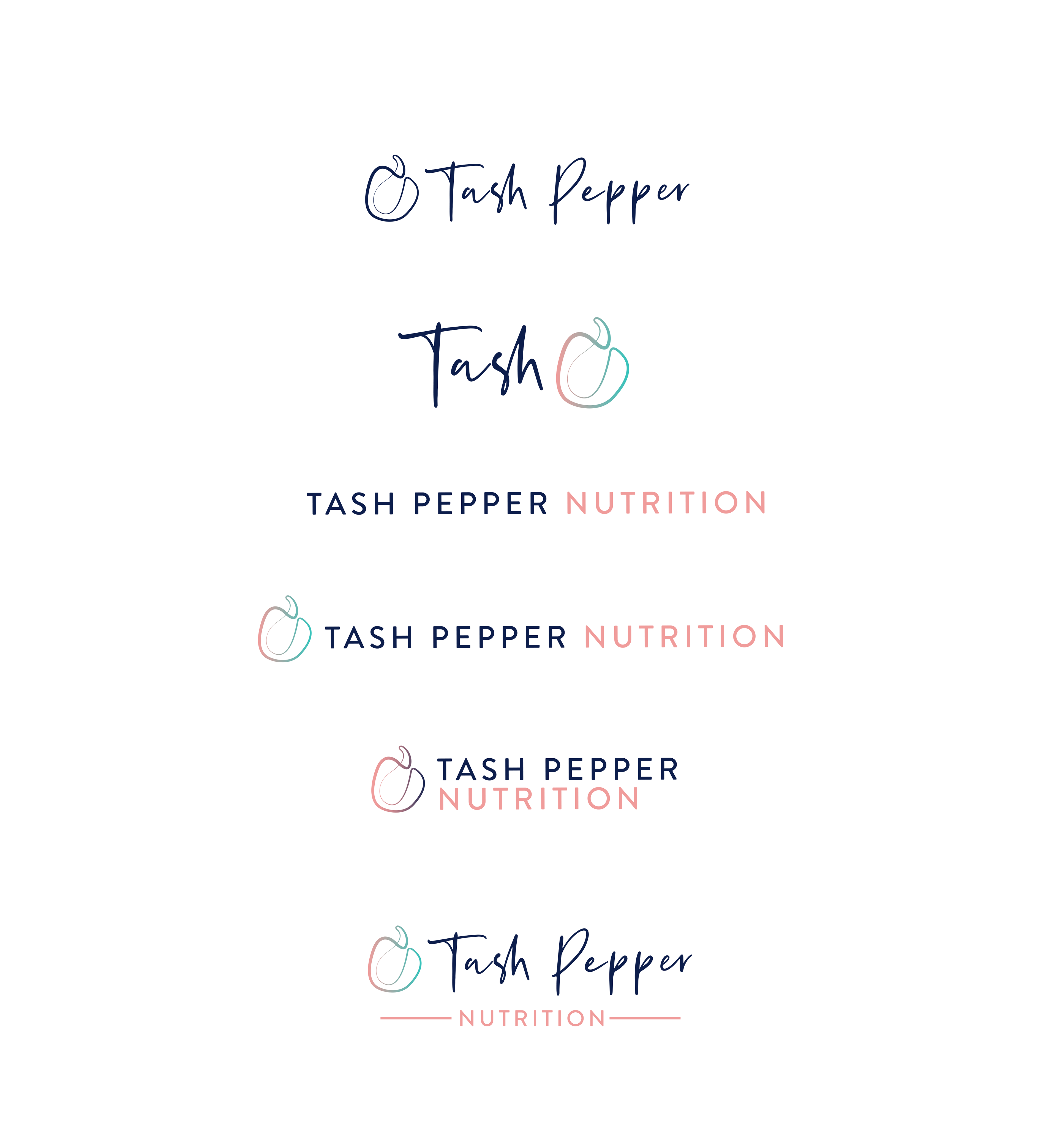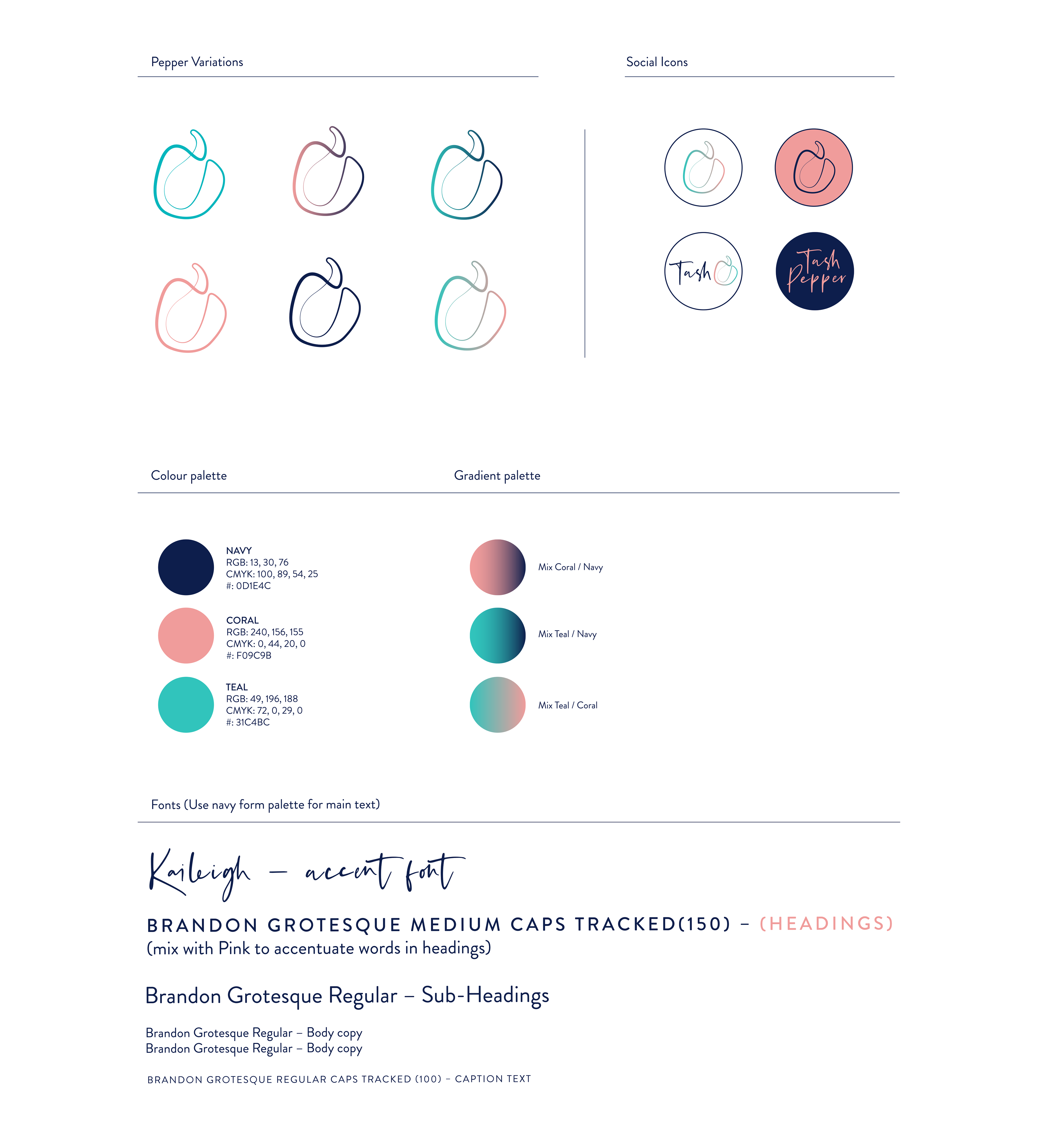
A brand logo and brand style for a Naturopathic Nutrition company. The client wanted a clear, simple logo to appeal to families, children and health services. They wanted to draw upon the Pepper element of the client name but retain a professional overall look and feel. We created several versions of the logo allowing the client brand to be quite playful but the services offered to be more serious where necessary.